Sunday, October 30, 2011

after a year


The ducks are finally out! Ha!
Actually I was talking about those gorgeous shelves, supposedly my Christmas present last year.
Not that the delay bother me over much. The point is that it's finally here, no?
And it's beautiful!

The shelves extend almost the whole length of the dining room. I am hoping that they would finally remove the (ever-present) clutter from the dining table: the various arts & crafts material, half read books, and whatever knicks knacks that found its way to the table.

At the same time, we are also hoping to relieve the overcrowding over at the ugly ahem, bookshelf.


We bought the old shelves from a local store and the Mister assembled them himself. My complains regarding that particular shelf, however, ranged from the sheer poor workmanship, bad quality material, wobbliness, to simple plain ugly.
Especially as compared to our old shelves in our old apartment:


Mmm... Yes, our old apartment was full of Ikea stuff. The consequences of living barely 15 minutes away from an Ikea store, I suppose.
In any case, both the shelves and the brackets were on sale that day, so we bought them and my handy Mister installed it and it made for a fantastic focal wall.

Much to our regret, we did not have enough presence of mind to actually take off those shelves and brought it with us across the sea. If you ever try to find decent furniture at reasonable prices around here you'll understand our regret.
In any case, we settled with buying the very same bracket from Ikea on our trip to Hongkong. For the shelves, however, we settled with locally sourced wood planks, which the Mister then had to sand, prime and paint himself.


T'was a long process spanning many days in which layers of primer and stain dry off before getting layered again the following day.


At the end of the whole painting process, I guess we got a bit tired, so it took a while before we continued to the next step, which was to prepare the wall for the shelves. After painstakingly marking the wall, the Mister found out that his drill couldn't handle the thick wall. Ugh. And so the shelves and the brackets stood in the storage for many months before we 'remembered' to ask the rental office to do the job for us. Duh!
For some reasons, we never thought of that before!

In any case, the carpenter appeared yesterday with his Makita drill (!), and finally finished the job after just a few hours.


For today we are just cleaning up while we take stock of our stuff: which one to stay, which one to move to the new shelves and the likes. The dining room already feels different with the addition of the shelves, and hopefully the dining table would get to see more use apart from repository of stray items in the house.
More pics later once we fill up the shelves. Until then!

Out of curiosity, do you prefer standing shelves (which can be used as room divider too, by the way) or wall shelves? Standing shelves require less work, most definitely, yet I love the wall shelves as they just create a focal wall in the house. What do you think?

Monday, October 24, 2011

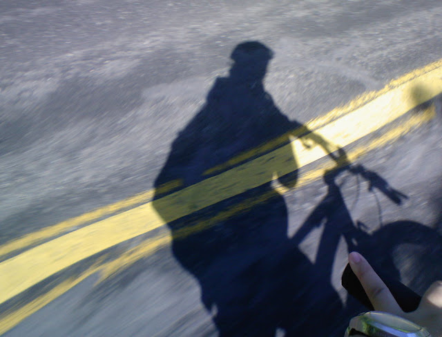
when the sun is up


When the storms and rains finally left
When the sun came back to its usual heat and brightness
When the blue skies return with the wisps of fluffy clouds
It it no longer the time to hunker down in the house and watch the season pass you by
And so we went out to embrace the weather, hot as it was
To enjoy, to appreciate, to explore
And sometimes, to rejoice in a long, almost forgotten activity ...


It's back to summer here in the two seasoned corner of the world!
Go out and enjoy!

Monday, October 17, 2011

Overthinking


Sometimes it's good to really stop, sit down, and think about what you are going to do.


But if you sit too long, someone might just jump ahead of you and do it first.

Lesson from the monkeys: Don't overthink it!

Sunday, October 16, 2011

Yet another spider


Ah yes, I think I am slightly over-obsessed with these spiders. But there are so many of them around here! We kept finding new ones every time we went out for our walkies, and this one happen to build its web so conveniently that I manage to get a full frontal shot.
The web had since been destroyed, not sure by human or sheer force of nature (read: storm?).
I haven't found the new residence yet, but I would still like to use this fellow there to remind you all:

Halloween is coming!

Oh I have some preparations to make.

For all the arachnophobes out there, sorry. But I do happen to think that this fellow up there totally gorgeous, and so appropriate for Halloween with its skull-like head. Of course, should it make a residence somewhere near MY house, I would sure be out armed with the broom to 'convince' it to make it's residence somewhere else.
After taking a few gorgeous pics, that is.

Thursday, October 6, 2011

Thank you

For being a source of inspiration
For providing many a great tools for so many
For finally getting an important family member into today's technology
For many things

Thank you

Rest in peace knowing that you have achieved many things that you had set up to do

Sunday, October 2, 2011

Blogger Tutorial: How to change your favicon

I have finally decided that those little icons had mocked me long enough.
It may have to do with the fact that I use Firefox as my browser, which shows those pesky icons on both the tab and the address bar. In comparison, Safari only shows those icons at the address bar.
Still, since I am more used to Firefox...

The itch might have started with noticing other blogs, especially Blogger-based blogs (with the telltale navigation bar), having their own favicon instead of the Blogger favicon.
There are many tutorials as well as favicon generator out there, but I previously put the idea aside while waiting for an inspiration for a logo of my own.

Until the itch became unbearable.

I should probably also talk about how I made my own 'logo' but we'll cover that in a different  post, if ever. It's a bit long, and I just found out I don't really fancy long posts. So!


  1. To start with, you need to have the proper image, a square image. The Wikipedia entry on favicon stated 16x16 pixels. Since the end result is pretty miniscule, no need for high definition, high resolution image. Blogger actually prefers that the image should not exceed 100kb!
  2. When you go to the Blogger Dashboard, choose your blog, and go to the layout. You'll see something similar to the image above. Click on the 'Edit' link (shown near the red arrow). You'll get to dialog box asking for the file from your computer.
  3. Choose your square image file. Click the 'Save' button.
  4. THAT'S IT!
If you image fulfills Blogger's requirement (it's square in dimension and less than 100kb), you'll see the favicon image changed immediately in the Blogger layout.
Your browser might take a bit longer to change. When I finally succeeded, it took about 1 day for the change to take effect on my browser.

The other thing to note is your image format. Most tutorials/references I read recommends .ico format for the image file. 
I used plain .png format.
It worked for me because I only use Safari and Firefox. 
If you use IE .... haha.. tough luck. You need to use .ico.

As mentioned before, there are favicon generators available on the net that will help you to create (and some even host!) your ico file.
However, I did not manage to use those successfully as somehow Blogger rejected the resulting image as not square
Don't ask. I have no idea.

Maybe I'll try again someday in the future (and implement an ico file for the sake of those IE users out there). But in the meantime, I shall bask in my own success in managing to change the favicon of my personal/family blog.

Siiiiggghhhh..... *contentedly admiring my own handywork.


Sunday, September 11, 2011

HTML fun: mouseover tutorial


I have been sitting on this tutorial ever since I read through SouleMama archives many months back.
Until I started tagging my images over in my personal blog, the mouseover trick had been collecting dust under the depth of a mile long Read-It-Later list.
Then I discovered and started playing with HTML codes (it's so fun!), and the tutorial was dug up and put on top priority list, just waiting for the right moment.
The moment came with Kecil's birthday and our weekend outing for the celebration. You can check out the post here, or you can use the image above. I simply cut and paste the whole code, so it's the same image.

Still don't know what I'm talking about? Try moving your mouse over the image above, and take the mouse out of range of the image. You see what I'm talking about now? Cool ya?

Here's how I did it:
  • First you need to prepare 2 images of the same dimensions, which you can either upload to image hosting of your choice (I usually upload mine to Picasa, since I can then place the image into my blog post very conveniently using the Blogger WYSWYG editor)
  • Place the first image into your post 
  • Then go to edit HTML
  • You want to locate the line below:
  • <img border="0" height="320" src="http://image1.JPG" width="256" />
  • Add the following addition anywhere within the <img .... /> onmouseover="this.src='http://image2.jpg'  "
    onmouseout="this.src='http://image1.jpg' "
  • Your line should now be something like this: <img border="0" height="320" src="http://image1.JPG" width="256onmouseover="this.src='http://image2.jpg'  " 
    onmouseout="this.src='http://image1.jpg' " />
  • which will give you Image 2 when your mouse hover over the image area, and Image 1 when your mouse is else where.
Just a few notes:
- Ensuring that your original 2 images are of the same dimensions will prevent any distortion
- I find that using Blogger original HTML codes as my base works well with me as a newbie since I don't really have the confidence to write from scratch. This is why I mainly use the WYSWYG editor and then just modify the code bit by bit.

Have fun!

Saturday, September 10, 2011

Creepy Crawlies


All these thinking about useful content is slowly killing me. 
So I decided to put on my creative hat, and just go out with the camera for the fun of it.


This rainy season, we apparently host a spider on our drying lines.
The spider, being pretty small, is able to hide itself in this stray strand of thread on the line, and build its web whenever nobody is looking.
Unfortunately, its size might have worked against it, as the rain almost inevitably bring down the web.
Well... that and also the occasional sunshine as we use the drying lines for its proper use.

I have been trying to capture our 'guest' for a while. Here's what we have so far:


Following some advice that I got of Digital Photography School, I sprayed some water on the web to make it more visible. The spider did not seem to like it much as it quickly pulled itself into a tight ball.
By the way, the stray white stuff in the background is that stray thread that is often used as the spider's hiding place when its web is down.

Soon after my spray bottle was commandeered by my 'assistant'.


I never expected myself to be fascinated by spiders, or any other creepy crawlies in general. However this particular spider fascinated me with every single effort to build up its web every time it was hit by rain.

Of course, the start of my fascination might also have come from the long ago photography assignment from DPS, the first one that I actually entered. Somehow, being told to photograph some creepy crawlies had changed my mindset from simply dismissing them to appreciating their beauty.

And just incidentally, we found more beautiful spiders not unlike the one I photography back then.


Unlike our puny 'guest', this one is huge! and its web had been withstanding an impressive amount of battering in the form of rains, winds and storms for the past weeks.
(Uhmm.. yeah, I have been checking out on it whenever we go out for our walkies).
The other interesting thing is also that on that tree where it makes its web, there are also two similar spiders building their webs. Huh! Imagine that.


It so happen that when I got my camera, the sun was shining through, illuminating the web so I did not have to spray any water. I don't think I don't dare to disturb this big a spider.
Just look at those legs!

That picture above, I have to admit, is my favorite so far. It's still far from perfect, but I simply love how the web lines simply draw your eyes along until you found the spider waiting for you at the end, ready to pounce.
It just speaks to me of the dangers lurking under the beauty found in nature.


Although these pictures are still far from perfect, I am pretty glad with the quality in general as they stand as testament to how much I have improved in my photography. With the serious upgrade of hardware, at least I am showing some progress since the last time I tried my hand on insect photography.
Oh, and no getting bitten, either! Hahaha!

So, have you done anything just for the fun of it lately?
Bonus points if the activity reveals some kind of personal progress.

Tuesday, September 6, 2011

Just google it!

Google screen shot
Still remember that 101 things I learned last week? Hoo yeah, I'd like you to meet my facilitator up above. My dearest Uncle Google.

Having jumped onto the internet bandwagon from 1996, I guess I have lived with the knowledge that you can find out just about anything from the internet. Anything.
Translating that knowledge into practice, however, is not quite an automatic.
Seriously, do you really Google every single question that came to your mind?
Not really.
Most of the time, I might stumble into the "I wonder..." mode, but simply left it hanging there.


It feels like such a huge waste, to have this very powerful tool in your hand and failing to use it, especially when it might prove to be to your benefit.

I really should get on with Googling things.
There's no harm, right? It's free, it's quick. In time, you might even increase your knowledge in general, and hopefully make you a better person.
There is no social cost of embarrassing yourself in front of anyone. It's just a series of computer algorithm.
I guess the only thing is just about the time aspect.
You'll never know where you'll get sucked into once you embark on your search.

Still, I did learn a LOT of things from acting on "I wonder..."s.
Yeah, like about 101 things.
So.. I guess it's not that bad.


How about you? Have you Googled anything lately?

Sunday, September 4, 2011

Taking screen shot in Mac

Mac screen shot
There are many ways in which you can use screen shots, especially if you are a blogger:
- to be included in your recommendation of this or that websites
- as illustration when you want to share a bit about your workflows
- as a quick visual record of things such as your own bog as well as other blogs in your reading list
- for grabbing quick images (of course, if you grab somebody else's image from the net and blog about it, it's only polite to attribute the image)
- and many more. I'm sure you can think of some other things. Including just for fun.
The Apple website does have a very short and sweet instructions for Mac capture screen which you can refer to. So, here I'll just cover other things such as the difference between the different methods, as well a few things to note that I learn from my own experience of using screenshots.


Shift++3
will give you a shot of everything on your screen at point of capture: your open application, the clock, battery indicator, everything. Check out my sample shot below:
Full screen shot (with excel)
Notice that the shot includes the Dock, my formula tab, my various indicators at right hand side, basically everything.
Suppose you do not want the whole desktop captured? You can either edit the first shot above, OR you can use the 2nd option:
Shift++4
Will turn your mouse pointer to a crosshair (with nifty numbers that indicate the size of your selected area in pixel) that will allow you to capture a selected area in your screen.
This selection can span different active windows, just as long as they are on your desktop.
You can see the comparison below:
Messy desktop (full screen shot)
Cascading corners using 2nd option
Pretty cool, but maybe sometimes you just want to show the whole of ONE active window, like maybe a browser, opened at a website you'd like to showcase. That's when the 3rd option is useful:
Shift++4+space
Will capture an active window of your choice.
As mentioned in the Mac tutorial, your mouse pointer would change 'shape-shift' to a small camera. Click the camera at your chosen window and you'll get your shot of just that window.
So, let's just say we start from the same cluttered desktop above:
Messy desktop
And you just want to take a shot of your web browser, basically you press the necessary combination of buttons on your keyboard, and click on the browser, and this is what you'll get:
Browser screen shot 1
Awesome, no?
Now for my own notes:
Additional notes
1. In my computer, all these images would be saved directly to my desktop in .png format. Very easy to find, and taking no time at all.
2. My images range from 50kb for a small selection shot (option 2) to a couple of hundreds kb for full window shot. I think it depends on how complex the picture is.
3. Of all 3 options, I think my favorite is the 3rd option (shift+⌘+4+space). It's slightly more tedious, but the resulting image is the most streamlined and fabulous looking among the rest. I love the slight shadow under the window. You might want to adjust your image posting preferences, however, as the shadow might interfere with your default image framing.
4. Privacy.
I like to have my bookmarks at my fingertips when I am browsing, but really, I don't really need the whole world to know which sites I bookmark. Yes? So before taking any window shot, I might want to first hide my bookmarks by using the browser preferences. Doing this, however, is a pain because I would have to return the settings to normal for my normal browsing activity.
If you look at the picture below, you'll see what I mean:

Browser shot comparison
My Firefox actually have a cool cat skin, which I like very much, but maybe I don't really want to show it to everyone. Now you see the tiny button encircled with the heart? That's your key for a quick, painless shot.
Click on that button, and it will hide/show your private stuff (like address bar, bookmark bar, etc).
This button is actually available in most Mac application, hiding/showing select toolbars. A very handy tool, indeed. For some reasons, it's not available in Safari, though.
That's all for today's tutorial, folks. I hope you find it useful, at least for the Mac users among you. I seriously have no idea about PC screenshots. Sorry!

Saturday, September 3, 2011

The 101 things I learned last week ...

the story
was that I had to finish a marketing plan as part of my study requirement.
It was ... let's just say that the result was more of a study of the things that you should NOT do in making a marketing plan.
The words dismal, incomplete, full of unmentionable things ... came to mind when I try to describe the end result. Sigh.


Still... on the good side, I have never seen myself applying so rigorously to the task ... of NOT doing the plan.
Oh dear. I surfed the web, I contemplated website designs, I played computer games I barely even enjoy, all in the name of NOT doing the work.
Unbelievable! Absolutely unbelievable!
So... yeah, I did learn quite a few stuff. Just too bad that it was not quite directly (or remotely) related to the project on hand at that time.
And with the submission deadline safely 12 hours behind, I have been gleefully reveling in the legitimacy of my other pursuits.
Like a 2-hour de-stressing using the aforementioned computer games straight after submitting the reports. Huhhh!

As for the other 101 things, I learned:
- that I am really bad with finishing a list. A month of useful content? Gone. A week of feature on the Dog? Lost in transit, or something. Other series? MIA without any trace.
- how to do html tags for my images
- that I'm not so keen on tagging my images one by one manually, and I simply let it lie
- there are many free beautiful blogger templates out there
- that I prefer using the old Blogger interface than the new one
- there are tools that would allow me create my posts offline (and hopefully help me improve my blogging in general!)
- New terms such as deep-linking, custom 404 page, favicon
- that I love certain aspects of designing
- how to be a code peeper (even if I have not much idea about coding and such)
- how to take proper screen shots (see picture above)
- the value of being organized
- how to 'upgrade' my personal blog using a free template not from Blogger's collection (see picture above. I'm so excited!)
- Googling is a very much under-utilized tool in my hand. I need to ask more question to Google.
- .....

Well... actually, now that I list them out, they are not really 101.
But especially after installing the new template successfully, with hardly any glitch, it just felt like a HUGE, BIG thing that I learn today.
And the accumulation of all those web-browsing, game-playing, generally-avoiding-real-work thingies just seem like a lot of new things learned over the past week.

Anyway, it's late, and I still have another program to install. We'll see if we can start sharing some of the knowledge I thought I learn from last week with all of you.
Thank you for staying in tune.

Edited 05/09/11 to add:
d.i.s.t.i.l.l.e.d is strictly my private diary, and hence, the perfect testing ground for my various experiments. I don't think I'm going to share the link, though. Hehehe.. just because I am mean like that. But I might still share screen shots. Cos I'm nice like that.

Wednesday, August 31, 2011

Happy Eid ul-Fitr


Some might say I am kind of late, but I *heard* that the official Indonesian holiday is only today.
So... Selamat Hari Raya Idul Fitri 2011, everyone!

Wednesday, August 24, 2011

Pet week: Penny the Companion


(Somehow, the Dog just grew into adulthood overnight. Haha!)
Well... actually, not long after moderately successful potty training, Mr. G's travels resumed and I was left with the Dog. We made good friends, so much so that the Mister often complained that the Dog is more mine than his. I guess I was there through most of her formative years (or months). Lucky me!
For I also got to deal with her 'formative' issues.

Penny, you see, seemed to have an issue with being blonde.

Penny is a Golden Retriever, and was a pretty active puppy. So... we try to understand and be properly accommodating. After completing all her shots, we started with the yard under the apartment building, and moved on to larger grounds around the complex.
Unfortunately, the yard under the apartment has this area where collected rain water created a small puddle in the corner instead of going all straight into the drainage. That area became a favorite for the Dog. Happy like a pig in mud, we would often find ourselves going down with a golden puppy, and back up with .... half golden (top) half muddy brown puppy.

As for the picture above, we scouted around and found this empty land where the Dog can run around without her leash. The shape of the lot was such that the entry is small so that we can (relatively) easily kept the Dog from running out of the area.
Unfortunately, at the far end, there was uncovered drainage. And of course the land being empty, the drainage collected all kinds of debris unchecked, providing the Dog with a perfect dyeing wading area with the result of a very happy and black(!) dog.

I am thinking that the apartment cleaner might have wondered about the dirt marks on the wall of the staircase. Ahem... yeah, sorry, that was us.
Shortly after, we found yet another empty land nearby, but with a clean water channel running through. So... after getting dirty in the first empty lot, we'll take the Dog to the second lot and she would emerge slightly cleaner. Like this:


Oh the joys of owning a dog! From the good, the bad, the expenses, the headaches...
But we love the Dog. Really.
Especially when the Mister is away, it was great to come home to have still somebody else waiting for you, even if they have four legs instead of two.
The Dog kept me sane, kept me moving.
I personally attributed many things about my first pregnancy having gone oh so swimmingly to this Dog.
The many long walks, for my easy delivery process, my reasonable weight gain, not to mention a pretty manageable moodswings. And of course, there is always the adoring company.

(We'll keep it short for today, but stay tune for the next installment: Penny the Jet Setter)

Tuesday, August 23, 2011

Pet Week: Penny the pup

After posting yesterday's post for I ♥ Faces, I thought, why not post more stories of the Dog? There are definitely many stories after 5 years of living with us, so... we might break it up into shorter posts. Here's the first installment:


We picked up Penny as a two-month-old puppy from a dog farm in Singapore. It was in January and we just got our end-of-year bonuses and we thought we would finally jump on the idea of getting a dog given the 2-year lease of our apartment then.

We did not count on getting a Golden, but I fell in love with this bunch of puppies at first sight and just couldn't let go of the idea. And so we got Penny out of the bunch, a puny little puppy with the shortest snout (my criteria of selection, don't ask).


T'was a long ride from the farm home, and the poor puppy actually vomited in the taxi! Luckily we carried with us some newspaper and we did not quite make a mess in the taxi.
Together with the puppy, we brought along quite a few stuff, a starter kit, if you will, bought from the same farm.
We heard before that those farms are not really top recommendation for getting puppies from, however, we were quite happy with the whole experience. Service was great, and although the place was quite in the middle of nowhere, they do provide full service from selling puppies, providing pet boarding, dog run and wading pool (for weekend), and even a fully stocked pet megamart. If you are considering getting a pet or even need supplies (especially for larger dog), the place is highly recommended. You can check out the website here.


The best part was getting the starter kit at the pet megamart. With a little puppy in hand, we were totally lost as to what to get, until a staff member came along and guided us at the toy section with the admonition to choose a toy or two for the puppy while he went around grabbing other stuff which he thought we would need.
A few minutes later, when he came back with a fully laden shopping basket, we were still gawking indecisively at the array of toys. Haha...


We took the few obligatory snaps the moment we came home, but subsequently, between toilet training, sleepless nights (the puppy cries at night!), the scramble to feed the Dog (she does not like the chow we got her), taking pics just slipped our minds. But we still have this precious shot of her squeezing under the coffee table.


Would you be very amused to know that the table in the picture was later on 'demolished'... uhmm... 'devoured' by that very same dog as she progress through puppyhood in which she proceeded to chew everything and anything around the house?
She did that, all right.
After all the hard work I put into assembling that piece of furniture! Hummpphh!

Anyway, that's our first installment on the Penny stories. Stay tuned to read more on her adventures, her issues with being blond, and her jet-setting ways.

Sunday, August 21, 2011

I ♥ Faces ~ Pet Week


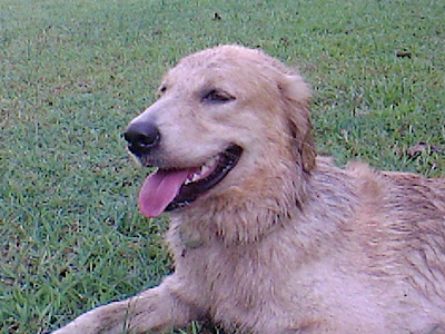
Our (going to be) 5 year old Golden Retriever had some problem with her hip last week. She has since recovered, her gait back to normal, no signs of pain or anything amiss, but the episode was a definite wake up call on her advancing age and mortality in general (dogs do not generally outlast their human 'family' and bigger dogs are generally have shorter lifespan as compared to smaller dogs).

Not to put a damper on your mood, but I guess TODAY is always a good chance to take some picture of your beloved pet just to ensure that you have something to remember such precious soul.

Here's our lovely, spoilt, wonderful, beloved dog:


golden retriever sleeping in the sun
Enjoying the sun

For more of my efforts in capturing the Dog, you can check out my other post.

Thursday, August 18, 2011

For Ramadhan

Actually it's already halfway through, the month of Ramadhan, in which Muslims around the world fast. This year the first of Ramadhan fell on 1st August, so... haha.. more than halfway through actually.
Maybe because I do not practice fasting. I am not a Muslim, is one reason. I tried before, out of spirit of tolerance to Mr. G. Uhmm... let's just say I barely last a few, very cranky days, after which I never bother trying anymore.
All fasting Muslims out there have my utmost respect for being able to follow through with such rigorous practice. Nowadays, I use my occasional bout of gastric problem as an excuse to escape.

Still, as an Indonesian, memories of Ramadhan is always a vivid memory, between the plethora of Ramadhan themed dramas on TV, to the rising prices of certain food items, to some delicious delicacies (especially of the sweet kind! Yum!) traditionally prepared for the breaking of fast, the beat of the beduk signaling the time to break fast, the ululating prayer immediately following, right to the sleepless eve of Eid ul-Fitr (or Idul Fitri as the Indonesian version goes) with its non-stop beduk and prayer chants all night long.

There are definitely more rambling about Idul Fitri itself as one of the most important holiday in Indonesia affecting most people in Indonesia in various ways, but maybe I should keep that to a different post and focus on today's topic.

As I said before, I am no foodie, but I can't resist to share just this simple desert I love, something quite traditional, not just for the month of Ramadhan, but also commonly had for normal desert. 

Start with a bit of pandan (screwpine) leaves, tied together for easy removal,

Chop some coconut sugar (so that it will dissolve easily)

Cut up some bananas, I used the not so sweet variety, to balance the sugar

Mix together in a soup of coconut milk, diluted with some water...
Add whatever additional ingredients you like (jackfruit, sweet potato, yam, pine nuts)
And voila! You have:

Kolak Pisang,
a delicious dessert, tea time snack, whatever you like it to be
You can have it hot, or you can have it cold
Have it as you like it

Oh well..that wasn't much of a recipe. I told you I'm no foodie.
Let's see if I can translate this one from Resep Keluarga Nugraha (plus some tinkering of my own):

Ingredients:
6 pieces of medium sized banana, sliced 1 cm thick (I prefer not so sweet)
250 gr of pine nuts, boiled till softened (or you can use the canned one in syrup)
8 tbs coconut sugar, chopped
2 tbs granulated sugar
1 tsp salt
500 ml coconut milk
2 leaves of screw pine (pandan)
(optional) 3 pieces of jackfruit, cubed

Directions:
1. Boil the coconut milk, sugars, salt and screw pine leaves to a simmer
2. Add the banana, jackfruit and the pine nuts, occasionally stirring to prevent separation of the coconut milk
3. Boil gently till softened (bananas would slightly change color)
4. Serve!

So simple! I love that I can find all the ingredients locally here in Philippines as they use roughly about the same ingredients for their food, except for the spices. Indonesians love to put WAY more spices in their food.

Anyway, I hope you can enjoy one of my favorite dessert. Have fun!

Wednesday, August 17, 2011

Project: Photos part deux


Earlier in March, I was muttering all kinds of stuff about organizing my photos.
I am quite happy to inform you that, despite all the kinks and imperfections, I have already come up with a working system since.
Armed with a new camera (which has created a super productive spawn of images in my library), a system is simply a necessary tool for survival.
So. Without further a due, let me share with you my system.

First stop, remember that my system is quite limited by both my hardware and software. My version of iPhoto ('08) does not come with all the nifty tools of its younger counterpart. No face recognition, for example. Just simply albums, tags, events. In any case, these 3 are the tools that I currently use to organize my collection.
Given an upgrade, most probably I would still stick to my system, only relying on the new tools (like face recognition) as a fall back or alternative searching method.

Second stop, events.
Event is my main tool for organization. You should know by now that when iPhoto imports your photos from your camera or your disk, you can either choose to have the pics automatically categorized into individual dates, or simply dumped into one single new event.
I find individual dates too cluttered for my taste, so unsorted pics would usually end up as a new event at the bottom of my display.
Many of my photos are basically of my Kid (I'm a relatively new Mom, sue me), so for these, they get categorized into 3 categories: at home, outdoor (for walkies and shoots from the garden) or outings. Every year I would make new event folders with similar titles.

The Dog has his own yearly event folder.

Should we have a special event like a trip somewhere, I might create a new event just for the duration of the trip, but increasingly I tend to stick to the original 3 categories.

For photos quite unrelated to the Kid, I would create separate events still, based on the subject of photograph (eg. flowers, macro, school, etc)

Third stop, album.
Albums are usually smaller than events (which are made on yearly basis), so basically they will contain a mini-event, a special occasion, or simply things I would like to group together for purposes such as posting in blog, printing, etc.

I only use this feature lightly so far. As for project, uhmm... haven't touched them, actually.

Fourth stop, tags or keyword.
I suppose tags (or key words) are really useful when you want to search for something specific in a large collection. However, I do find the manual tagging VERY inconvenient.
I do prefer flagging my photos temporarily, select all from the flagged folder, create an album from the selection, and voila! I'm done. I can always look up for the content through searching the title of the album.
This totally beats inserting keyword one by one on every photos.
If apparently there's a function to insert keywords on a batch of photos, I have not found it.

Online library
For my online library, which I basically use mostly for blogging purpose, I only use the simplest system, chronological. Basically I would have an album for each month of the calendar, consisting of all the photos that I include in my blog posts for that month.
There might be some extra photos uploaded that I eventually do not use.
These photos I usually delete around the end of the month.
They usually stand out due to the low view-count, haha.

Last note
This is a rough sketch of the system that currently works for me. May not be perfect, but it works so far. In the meantime, I am always on the lookout for better ways.
The system might not work for you, but I guess it can always be a starting point.

Rachel from the Small Notebook also reminds me that the delete button is one VERY important and useful tool in organizing photos. But I have not had the heart to delete most of my photos.
I do, however, select carefully the pics that I would post online as I do not have unlimited storage online AND I prefer to show off only the better ones. Ha!

I hope you'll find this useful.

Tuesday, August 16, 2011

I ♥ Faces ~ Beautiful Eyes


I just found (yet another) photography site with weekly competitions, tutorials, etc.
Although there has been many assignments, competitions, weekly themes everywhere around the web, I have not felt comfortable enough to join in any of them.
This one, however, somehow feels more ... personal, more doable, somewhat closer
So I'm going to take a jump, at the very last minute, no less, and submit an entry.
We'll see how it goes as we go along.


I chose this photo because somehow I feel that all her mischief, her joy and her laughter are all there in her beautiful eyes, captured despite the blur.

Join the fun at I ♥ Faces